Design System Across Web + Native
Keeping a PWA, a Next.js web app, and an Expo native app visually consistent without a design team is a systems problem, not a components problem.
Published
Cross-Platform Consistency Is a Systems Problem Until It’s a Platform Problem
What I learned trying to keep three surfaces consistent without a design team. Why component libraries are no longer enough in the AI era. And the case for what I would build instead, the next time someone hands me a blank monorepo and a Claude API key.
Opening
Cross-platform consistency is a systems problem until it’s a platform problem. That is the short version of what I learned trying to keep three surfaces of olllo visually coherent.
The longer version is two layers deep, and the case study has to walk both. The first layer is the work itself: shadcn/ui as a primitives base, NativeWind to carry Tailwind syntax to the Expo mobile app, a four-layer component hierarchy enforced by the project constitution, a Next.js manifest making the web installable as a PWA. The second layer is the realization that what I had was not a design system. It was a component library wearing the words “design system” on its package.
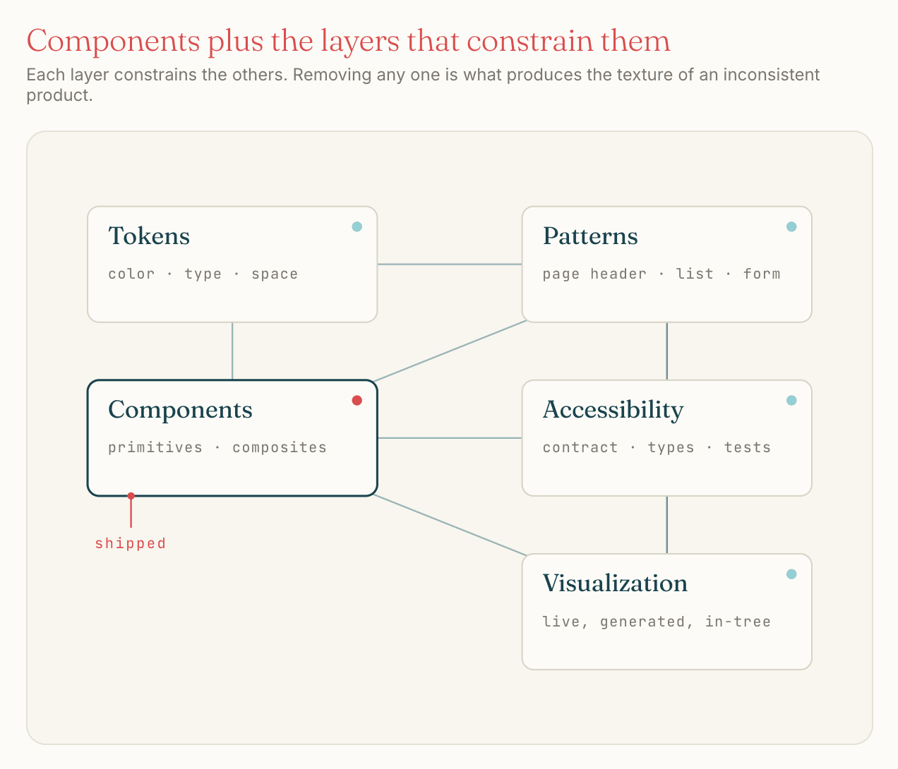
That distinction was uncomfortable in a useful way. I had built four design systems before olllo (an Angular system, a web components system, a React system, and one on top of Chakra UI) and across all of them the lesson had been the same. The components are not the system. The patterns are. The instructions for how a button, a header, and a section interact when they appear together are. The tokens for color, spacing, type scale, and motion are. The accessibility contract is. The visualization layer that lets a non-engineer see what the system produces is. A component library is one ingredient. A design system is the recipe.
I knew this going in. I built a component library anyway, called it a design system, and moved on. Then AI started composing my components, and the gap between what I had and what I needed got loud.
What I actually built
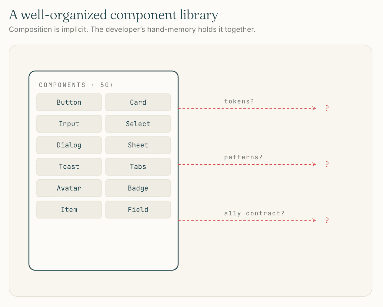
packages/design-system looks like a design system from the outside. Inside, it is a well-organized component library:
packages/design-system/
├── components/
│   ├── ui/         # shadcn/ui primitives (50+ components)
│   ├── kibo-ui/    # chat & AI surface components
│   ├── forms/      # form field wrappers (FormInputField, FormSelectField)
│   └── pricing/    # pricing-related composites
├── hooks/
├── providers/
├── styles/
├── lib/
├── components.json # shadcn config: New York style, neutral base, CSS variables
└── postcss.config.mjs
Underneath it: shadcn/ui in the New York style, neutral base color, CSS variables for theming, lucide for icons, and a kibo-ui component family pulled in for chat and AI surfaces specifically. The mobile app uses the same Tailwind class vocabulary via NativeWind, with a separate tailwind.config.ts mirroring the web config where it can. The PWA is the Next.js app with a manifest declared at apps/app/app/manifest.ts, so “three surfaces” is honest but the third surface is a wrapped second surface.
Component placement is governed by the four-layer hierarchy from the project constitution: design-system primitives, app-shared components, layout-shell components, and feature-route components. That hierarchy was the closest thing in the project to actual pattern documentation, and it is documented and enforced through speckit (Culture as Code covers it).
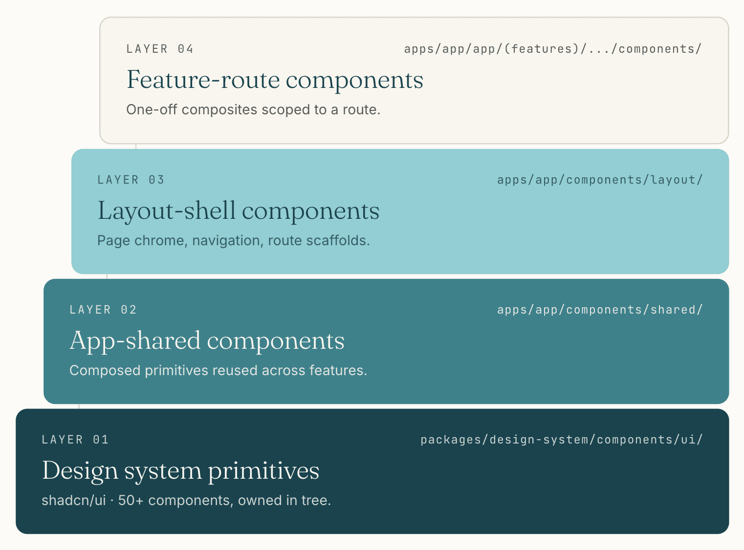 The four-layer hierarchy from the project constitution. The boundary each layer enforces is the only formal pattern documentation the system has.
What is missing from this picture, viewed against any of the four design systems I had worked on before, is everything that turns a component library into a design system: documented composition patterns (when to use a Card versus an Item versus a Field, and what they should contain), motion tokens and motion guidelines, an opinionated accessibility contract beyond what shadcn ships, a visualization layer that demonstrates patterns rather than individual components, and a place where a non-engineer could review the system’s output without reading code.
I built none of that. I shipped on what was good enough for one engineer composing components by hand or by prompt, and the case study below is what that decision cost.
What shadcn/ui gave me, and what it didn’t
shadcn/ui was the right primitives layer for olllo at the moment olllo got built. The flexibility is real (every component lives in your codebase, customizable to the file), the breadth is meaningful (50+ ui primitives plus kibo-ui’s chat and AI components saved me weeks on the assistant surfaces specifically), and the integration with Tailwind and the AI tooling around it was unmatched in early 2026.
It is also not a design system. Nothing about shadcn/ui tells you when to use a Card versus an Item versus a Field for a list of accomplishments. Nothing about it constrains a button’s size to match the page-header pattern. Nothing about it documents composition. The library hands you components and gets out of the way, which is exactly what makes it useful and exactly what makes it insufficient as the only artifact in the design system slot.
Would I pick shadcn/ui again? No. The calculus has shifted in two ways since olllo started, and both push toward building something custom.
The first shift is in what I weight. Long-term stability matters more to me now than it did at the time. shadcn ships components into your codebase that you own, which is good, but the conventions around them keep moving. Tailwind has its own breaking version cycle. The NativeWind plus Tailwind combination on the mobile side adds another moving part. A custom system has a single stability surface, the code I wrote, with no version mismatches between layers and no upstream conventions evolving underneath me.
The second shift is AI capability. The reason “build from scratch” was prohibitively slow at the start of olllo was that custom design systems are months of repetitive scaffolding work. AI assistance has improved enough that the same work moves significantly faster now. The build-custom path that was infeasible against the product work is feasible today, and would land me in a better long-term place than reaching for shadcn would.
Net: shadcn was right for where I was at. The tradeoff has changed. The next system I build will be one I own end to end, with AI assistance accelerating the construction rather than a third-party library accelerating my dependence.
The AI composition problem
The clearest moment I have for this case study is small, specific, and recurring.
The standard SaaS page-header pattern is a title on the left, optional breadcrumbs above it, and a primary call-to-action button on the far right. Across olllo’s authenticated surface, that pattern appears on every list view and most detail views: Accomplishments, Goals, Reflections, Settings, every one. The button on the far right is the page’s primary action: New Accomplishment, Add Goal, Start Reflection. There is one canonical visual treatment for that button, and there should never be variation.
Across thirty-eight numbered features, the AI sometimes rendered that button as size="default" and sometimes as size="sm". Not because the prompt asked for variation. Not because I wanted variation. The model would pick a size, often the right one, sometimes a smaller one, with no reliable way to predict which.
I added checks and balances. Component conventions in CLAUDE.md. Examples in the closest spec file. A note in the constitution. Type-level constraints where I could push them down. The variation kept happening.
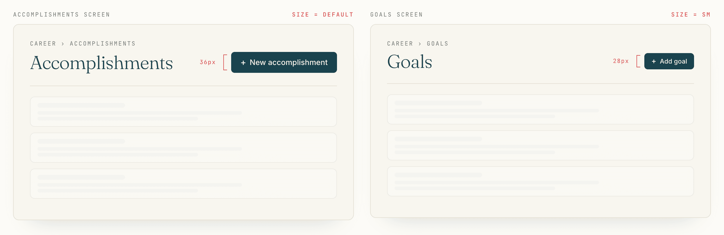 The variation users feel without naming. The component library allows it; the design system that should have prevented it does not exist.
The diagnosis is two parts.
The first part is a failure of the component library. shadcn’s Button component takes a size prop with default, sm, lg, and icon as values, and the component does not encode the page-header pattern. There is no Button variant called pageHeaderPrimary that is locked to the canonical size. The component library is correctly generic and incorrectly silent on the pattern.
The second part is the AI part, and it is the new part. A solo developer composing components by hand, with a component library and no design system, will be reasonably consistent over time because their hands have a memory the file system doesn’t. A solo developer composing components with an AI assistant has none of that hand-memory advantage. The assistant has an opinion about button size every time it generates a page header, and the opinion drifts. Today’s prompt produces size="default". Next week’s prompt, with no relevant change in context, produces size="sm". The model is not wrong; the model is correctly inferring from a library that does not constrain the choice.
This is not a shadcn problem. It is a category problem. Component libraries assumed a developer was the constraint on consistency. With AI in the loop, the assistant is making the composition decisions, and a library that does not encode patterns will be composed inconsistently.
The AI era moves the design system requirement from useful to necessary. Without one, every prompt is a small bet on whether the model remembers what consistency looks like in your project. Some of those bets land. Enough of them land badly that a careful reader can feel the inconsistency even if they cannot name it.
That feeling is what users mean when they say a product feels off without being able to point to anything specific. It is the texture of an inconsistent system, and component libraries cannot prevent it on their own.
Why flexibility is the cost
The deeper read on this applies to any flexible component library used as the foundation for a consistent product, not just shadcn or Tailwind specifically.
The more flexible the library, the more variations an AI assistant can choose from on any given prompt. Every prop, every variant, every size, every spacing class is a degree of freedom for the model. A library with five button sizes generates more visual variation than a library with two. A library where Cards can contain anything generates more variation than one with a strict slot pattern. A library where margin can be any of twenty Tailwind classes generates more variation than one with three predefined spacing tokens.
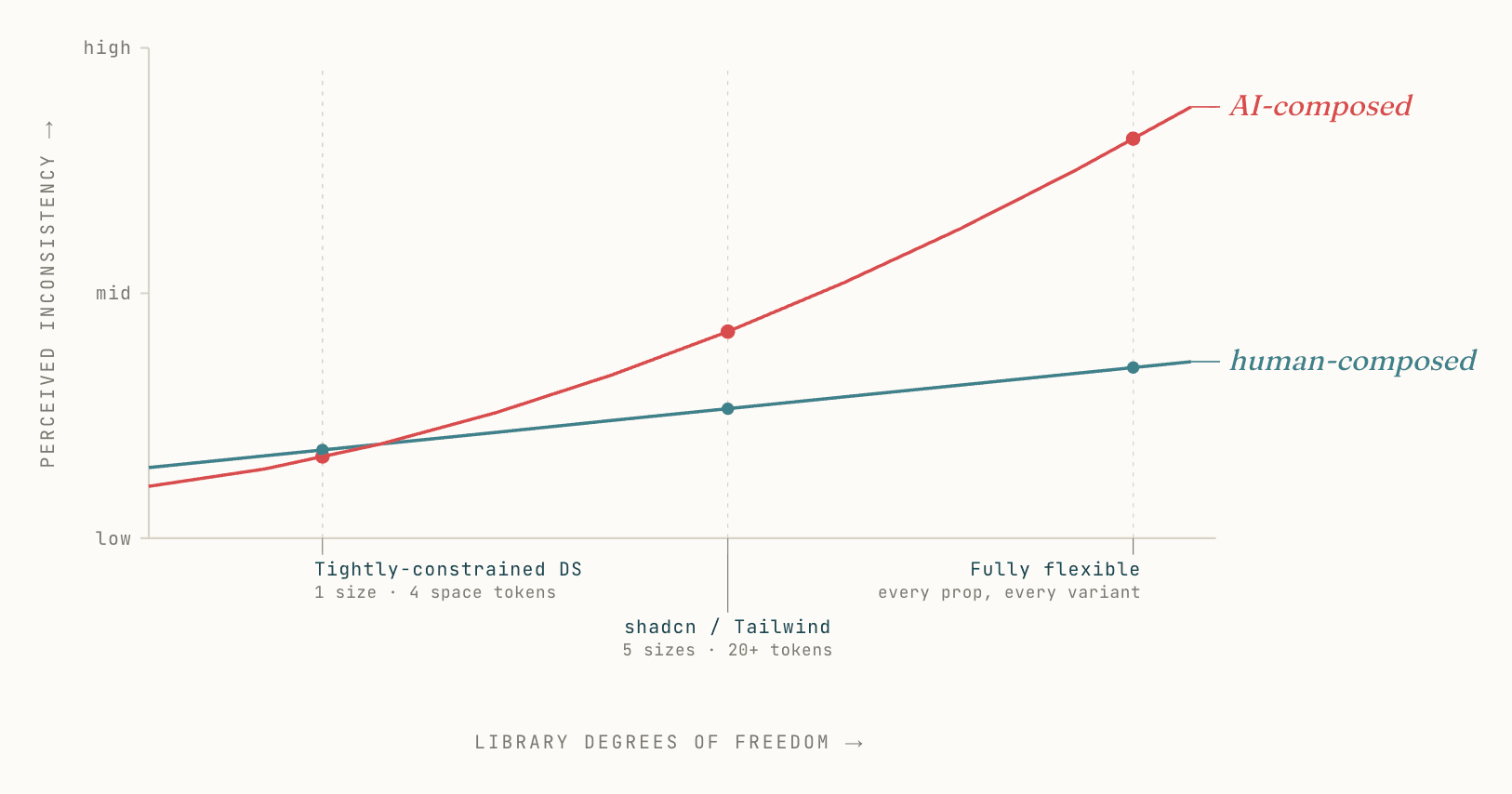 AI composition compounds flexibility into inconsistency much faster than a human composer does. The crossover happens around shadcn/Tailwind’s degrees of freedom.
This is exactly why people love shadcn and Tailwind. The flexibility is the feature. Pre-AI, that flexibility let solo developers ship fast and tailor everything. In the AI tooling era, the same flexibility is what makes v0, Lovable, Bolt, and similar generators work at all: the model can satisfy almost any prompt because the underlying primitives can be assembled into almost any output.
The same property that makes a library good for AI tools that build is what makes it bad for AI tools that compose inside an existing product. When the goal is an opinionated UI driving consistent feel across forty-plus surfaces, flexibility is the enemy. The best design systems are the ones with the most constraints: one right way to render a page header, one right way to lay out a card, one right way to space a form. Constraints are how the system stays the system across hundreds of compositions.
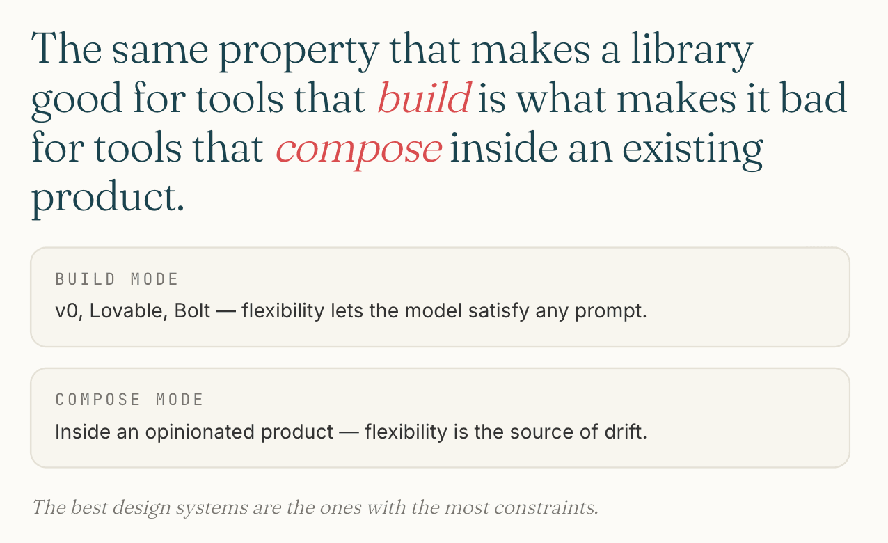 Build mode and compose mode want opposite properties from the same primitives.
shadcn and Tailwind sit at exactly the wrong end of that spectrum for the consistency goal. That is not a critique of the libraries; it is a recognition that the same primitives used in two modes (build a thing fast, or compose inside an existing thing consistently) require opposite properties.
The platform problem reveals itself
Even if every component had been perfectly consistent across the codebase, cross-platform consistency would still have been the wrong goal in places.
NativeWind let me carry Tailwind class syntax into the Expo mobile app, which made styling cheap to author. What it did not carry was platform conventions. iOS users expect a sheet to slide up from the bottom with a specific easing curve, dismiss with a specific gesture, and use the system’s blur and depth conventions. Android users expect different defaults. A web user expects neither. Tailwind classes do not translate any of this; they translate visual properties.
The result was a mobile app that looked consistent with the web app at the pixel level and felt slightly off in the hand. Not broken. Not unusable. But the kind of subtle wrongness that native developers spot in a second and that translation-layer apps never quite shake.
Solo Architecture covers the broader Expo reconsideration in detail. The design system angle on it is specific: the goal of cross-platform consistency was, in retrospect, the wrong target for half the surface area. Native iOS users do not benefit from a button that looks identical to its web counterpart. They benefit from a button that uses iOS-native press behavior, haptic feedback, and platform-typical visual weight. The cross-platform consistency I was protecting was protecting nobody.
The right framing, with hindsight: there are surfaces where cross-platform consistency is a feature (brand, copy, identity color), and surfaces where it is a tax (interaction patterns, transitions, gesture vocabulary). A design system that does not distinguish between those surfaces will get both wrong.
The Storybook gap
Component libraries need a visualization layer. Storybook is the default answer in the React community, and Storybook is its own friction.
The version compatibility story is the worst part. Major version upgrades break stories, sometimes silently. Add-on ecosystems lag the core release schedule. CSF 2 to CSF 3 was not a free migration. A monorepo running Storybook against a Next.js 16 app and a separate Vite-based design system has at least three places where versions can disagree, and they sometimes do.
I shipped Storybook in apps/storybook because the alternative was no visualization layer at all. I did not maintain it as actively as the rest of the monorepo. Stories drifted from their components. Some were rewritten on every Storybook upgrade. By the end of the project, Storybook was a graveyard of partly-true documentation, which is worse than no documentation in one specific way: a reader trusts a partly-true Storybook the same way they trust a complete one, and gets misled.
The lesson is not that Storybook is bad. Storybook solves a real problem and there is no obvious better answer in early 2026. The lesson is that the visualization layer being a separate piece of infrastructure with its own upgrade cycle, addon catalog, and configuration is a structural mistake the industry has not yet corrected.
A design system worthy of the name should not require its visualization layer to be a separate framework with separate breakages. Components, patterns, tokens, accessibility tests, and visual documentation should live in one system that upgrades together.
What I’d take into another product
Build the primitives layer myself, with AI assistance, rather than reaching for shadcn/ui. The build-custom path is feasible today in a way it was not when olllo started. Long-term stability (owning every component, every token, every pattern, with no version mismatches between layers) is worth more to me now than the day-one acceleration shadcn provided.
Treat the component library as one ingredient, not the whole system. Document composition patterns explicitly, in a place AI assistants will read on every session. CLAUDE.md is one such place; a richer version would be a patterns.md per package, with concrete examples of what good composition looks like and what to avoid.
Distinguish cross-platform consistency from cross-platform translation. Brand and identity should be consistent across surfaces. Interaction patterns should follow platform convention. Carry Tailwind syntax across surfaces if it helps, but stop pretending the result is the same product everywhere.
Skip Storybook unless and until something fundamental changes about how it is maintained. Use a smaller scoped solution (a single docs route in the design-system package, generated from real code, updated at build time) until the industry produces a unified visualization layer that does not break on its own.
The thing I would not bring forward at all is the unspoken belief that a component library plus tokens equals a design system. It does not, and the next product I build will be honest about that from day one.
The future I’d build toward
The future of design systems in the AI era is a single integrated system, not a piecemeal of separate ones.
Today the responsible solo setup glues several pieces together: a primitives library, a token layer, separate accessibility testing, pattern documentation in CLAUDE.md or similar, Storybook for visual review, a motion library, and the developer’s hand-memory holding it all together. Each piece has its own upgrade cycle and its own way of being out of date. The cracks between them are where AI composes inconsistently.
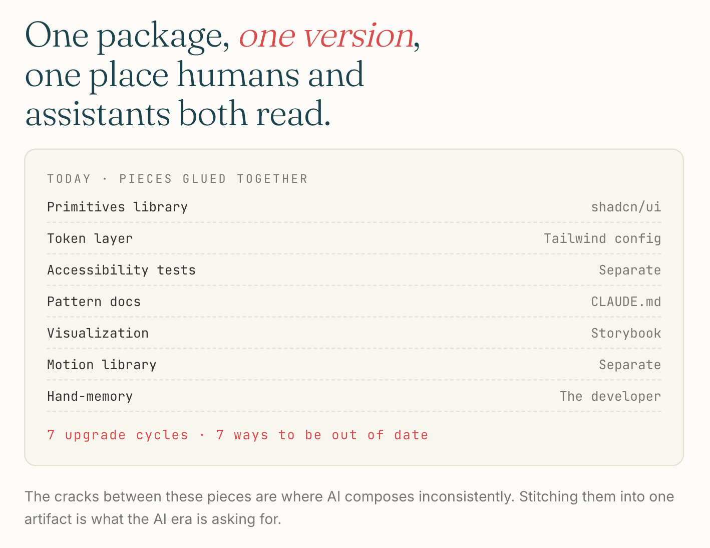 Seven pieces, seven upgrade cycles. The cracks between them are where AI composes inconsistently.
The system I would build would unify these into a single source of truth that both humans and AI assistants can read and respect:
- Components, tokens, and patterns in one package, versioned together
- Composition patterns expressed as types, so the AI sees the constraint and the human sees the demonstration
- Accessibility contracts encoded into component types, not retroactively tested
- A built-in visualization layer generated from the same source as the components, with no separate Storybook to drift
- A pattern enforcement layer that catches “wrong size for this context” the way TypeScript catches “wrong type for this argument”
The pieces exist in fragments today. Stitching them together is what the AI era is asking for. Someone will build it, because the cost of not having it compounds with every prompt that adds a small inconsistency to a product supposed to feel coherent.
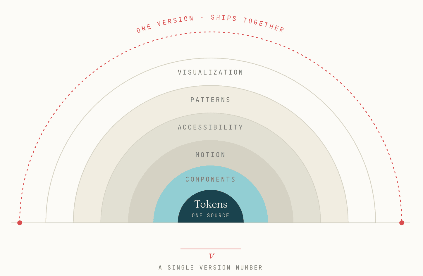 The system the AI era needs. One source of truth, one version, one place where humans and assistants both go to learn what consistency looks like in this product.
Where this leaves us
A design system in the AI era is no longer optional infrastructure for products that want to feel coherent. The composition decisions are happening whether or not the system encodes them; the question is whether they happen with constraints or with drift.
Component libraries solved a real problem in the developer-as-composer era. That era has changed underneath us, and the libraries have not caught up. The interim discipline (explicit composition patterns in places AI will read, treating consistency as a contract instead of a hope, distinguishing the surfaces where consistency helps from the ones where it hurts) is the work of bridging the gap until the industry produces a system that closes it.
What I built for olllo was the best I could ship solo in the time I had. What I learned building it is the more interesting half of this case study, and the part I would carry into anything I build next.